
Climate Gate: How To Make Your Own Hockey Stick, A Guide

 IN “Fables of the Reconstruction (Or, How to Make Your Own Hockey Stick)”, Anorak’s Man in the Mid-West Hockey Belt enters the lab and produces a Climate Gate ‘How To’. Please pardon the departure from the usual Iowahawk bill of fare. Pardon:
WHAT follows started as a comment I made over at Ace’s last week which he graciously decided to feature on a separate post (thanks Ace). In short, it’s a detailed how-to-guide for replicating the climate reconstruction method used by the so-called “Climategate” scientists. Not a perfect replication, but a pretty faithful facsimile that you can do on your own computer, with some of the same data they used.
Why? Since the Climategate email affair erupted a few weeks ago, it has generated a lot of chatter in the media and across the internet. In all the talk of “models” and “smoothing” and “science” and “hide the decline” it became apparent to me that very very few of the people chiming in on this have even the slightest idea what they are talking about. This goes for both the defenders and critics of the scientists.
Long story, but I do know a little bit about statistical data modeling — the principle approach used by the main cast of characters in Climategate — and have a decent understanding of their basic research paradigm. The goal here is to share that understanding with interested laypeople. I’m also a big believer in learning by doing; if you really want to know how a carburetor works, nothing beats taking one apart and rebuilding it. That same rule applies to climate models. And so I decided to put together this simple step-by-step rebuilder’s manual.
Regardless of what side you’ve chosen in the climate debate (I’m not going to pretend that I’m anything but a crazed pro-carbon extremist) I hope this will give you a nuts-and-bolts understand what climate modeling is about, as well as give some context to the Climategate emails.
Got 30 to 60 minutes, a modest amount of math and computer skills, and curiosity? Read on.
Paleoclimatology and the Art of Civilization Maintenance
Before jumping straight to the math stuff, let’s cover some preliminaries.
There is widespread acceptance of the fact that global temperatures rose to some extent in the latter part of the 20th Century, compared to various baseline periods from the 19th through early 20th Century. Let’s not quibble on that point. Whether that fact is worth losing sleep over really depends on how big of an increase it is was; 150 years is a nanosecond on the geological calendar, and a slight temperature rise over a century of two may not be any big whoop if similar (or bigger) increases have occurred the past. What’s needed is a long view — say, 1000 years or more.
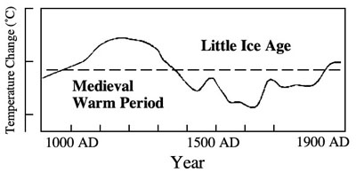
That’s where paleoclimatology comes in. Paleoclimatology concerns itself with figuring out what climate was like in the past; e.g., “climate reconstructions.” For the really really distant past, say the Paleozoic Era, climate is inferred from geological records, rock formations, fossils and the like. For more recent past (say the last 1000 years), traditional methods of climate reconstruction used a combination of human historical records (European harvest dates, sea explorer notations of ice floes etc.), plant and animal records (tree rings, the northern geographic spread of plant and insect species), celestial data (e.g. sun spots), and other indicators. They weren’t at a high level of granularity or statistical sophistication, but the traditional reconstructions generally agreed there was a “Medieval Warm Period” between roughly 1000 and 1350 AD, followed by a “Little Ice Age” approximately from 1350 to 1950, from which we are now just emerging.
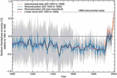
Over the last 20 years or so, paleoclimatology saw the emergence of a new paradigm in climate reconstruction that utilized relatively sophisticated statistical modeling and computer simulation. Among others, practitioners of the emerging approach included the now -famous Michael Mann, Keith Briffa, and Philip Jones. For sake of brevity I’ll call this group “Mann et al.”
The approach of Mann et al. resulted in temperature reconstructions that looked markedly different from the one previously estimated, and first receive widespread notice in a 1998 Mann paper that appeared in Nature. The new reconstruction estimated a relatively flat historical temperature series until the past hundred years, at which point it began rising dramatically, and accelerating around 1990. This is the celebrated “hockey stick” with which we are all familiar.
Wow! Science-y!
The consequences of this reconstruction are even more dramatic. If one subscribes to the older reconstruction, the recent increase in global temperatures are real but well within the range of temperatures seen over the past millenium (by some estimates Earth is still more than 1 degree cooler than during the Medieval Warm Period). For good or bad, our recent warming can be explained as the result of natural long term climate cycles. In this view, long term temperatures rise and fall, and have a fairly weak association with human population and CO2 production.
But… if the Mann et al. reconstructions are correct, recent temperatures are well beyond the range seen in over the past 1000 years. Foul play is assumed and the hunt is on for a culprit; a natural suspect is man made CO2, which has increased coincidental with temperatures. It’s a small part of overall global greenhouse gases (5.5% if you don’t include water vapor, 0.3% if you do), but maybe — just maybe — the atmosphere is in a delicate, wobbly, equilibrium balance. Even a small increase in human CO2 might push it past a catastrophic tipping point — a conclusion that is bolstered by the hockey stick. Therefore, as this view has it, our survival depends on massive and immediate reductions of human made CO2 emissions.
This is essentially the “settled science” that has been the basis for emergency carbon treaty fests like Kyoto and Copenhagen, and it’s hard to overstate the role that the research of Mann et al. has played in creating them. In the 2001 IPCC report the hockey stick was given a starring role and Mann was lead author of the chapter on observed climate change.
Given the enormous economic stakes involved, you might think the media would have some spent a little time explaining the models underlying the hockey stick. Ha! Silly you. Whether it was a matter of ideological sympathy or J-school stunted math skills, press coverage has generally stuck to the story that there’s an overwhelming scientific consensus supporting AGW. As proven by brainiac scientists with massive supercomputers running programs much too complex for you puny simian mind.
Au contraire! The climate reconstruction models used by Mann, et al. are relatively simple to derive, don’t take a lot of data points, and don’t require any special or expensive software. In fact, anybody with a decent PC can build a replica at home for free. Here’s how:
Stuff you’ll need
1. A computer. Which I assume you already have, because you’re reading this.
2. The illustrative spreadsheet, available as an Open Office Calc document here, or as a Microsoft Excel file here. Total size is about 1mb.
3. A spreadsheet program. I highly encourage you to use Sun’s Open Office suite and its included Calc spreadsheet — it’s free, very user friendly and similar to Excel, and it’s what I used to create the enclosed analysis. You can download and install Open Office here. You can do all of the examples in Excel too, but you’ll also need to download an additional add-on (see 4 below)
4. A spreadsheet add-in or macro for principal components analysis. Open Office Calc has a nice one called OOo Statistics which can be download and installed from here. This is the macro I used for the enclosed analysis. If you’re using Excel, you’ll have to find a similar Excel add-in or macro for principal components analysis. There are several commercial and free versions available.
Okay, ready? Now let’s start reconstructing. Open the illustrative spreadsheet and follow the bouncing ball.
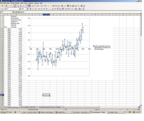
Step 1: Get some instrumental global temperature data
On the first tab of the spreadsheet you’ll find an estimated Northern Hemisphere annual temperature series for the years 1856-2001, along with an associated graph. The source data here were copied from NOAA, and cited to Philip Jones from the University of East Anglia. The values are scaled as degrees celsius difference from the average in 1961-1990.
“A-ha! This is the garbage data that was…” Hold that thought, we’ll get to that later. Let’s assume for the time being that the temperature measures are valid; remember, the goal here is to roughly replicate the Mann et al. method of temperature reconstruction. Assuming the temperatures are valid, the series visually certainly seems to indicate a recent increase in Northern Hemisphere temperatures. But it only goes back around 150 years.(all subsequent pictures can be click-embiggened)
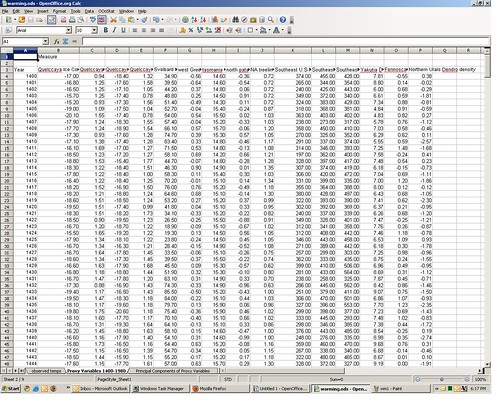
Step 2: get some high frequency proxy data
Although observed temperature measurements prior to 1850 are unavailable, there are a number of natural phenomena that are potentially related to global temperatures, and can be observed retrospectively over 1000 years through various means. Let’s call these “proxy variables” because they are theoretically related to temperature. Some proxies are “low frequency” or “low resolution” meaning they can only be measured in big, multi-year time chunks; for example atmospheric isotopes can be used to infer solar radiation going back more than 1000 years, but only in 5-20 year cycles. Other low frequency proxies include radiocarbon dating of animal or plant populations, and volcano eruptions.
By contrast, some proxy variable are “high frequency” or “high resolution,” meaning they can be measured a long time back at an annual level. Width and density of tree rings are an obvious example, as well as the presence of o-18 isotope in annually striated glacial ice cores. In principle this type of proxy variable is more useful in historic temperature reconstruction because they can be measured more precisely, more frequently, and in different places around the planet.
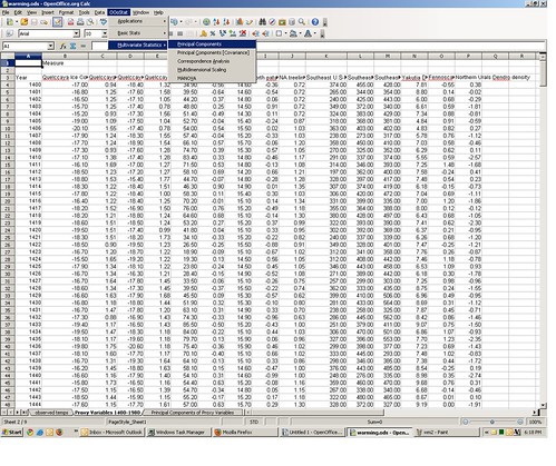
On the second tab in the spreadsheet are a candidate set of those proxy variables. I downloaded these data from Michael Mann’s Penn State website here, with column descriptions here; long description here.
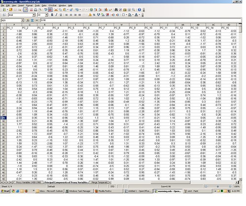
The column headings in the spreadsheet (row 3) give a brief description of the proxy variables, all of which are either tree ring width, tree ring density, or glacier ice core o-18, and the series extends back to the year 1400 AD. I would have preferred to have used the 1000-year MXD (“Maximum Latewood Density”) proxy variables often used by Mann et al. but the University of East Anglia site no longer allows downloads of it.
Step 3: Extract the principal components of the proxy variables
Huh what? “Principal components”?
Here’s the deal: now that we’ve got the temperature series and the proxy variables, a tenderfoot statistician is tempted to say, “hey — let’s fit a regression model to predict temperatures from the proxies.” Good intuition, but there are potential problems if the predictor variables (the proxies) are correlated with one another — e.g., imprecise coefficients and overfitting. (and if you’re wondering what a “regression model” is, don’t worry, we’re getting to that soon.)
One way of dealing with the problem of correlated predictors (and the one used by Mann et al.) is through the method of principal components, which “uncorrelates” the predictors by translating them into a new set of variables called principle components. Nothing nefarious about this, it’s a standard statistical technique. If you want further explanation, read the indent; otherwise skip ahead.
In a nutshell principal components analysis (PCA) works like this, in matrix notation:
P = Xw
X here represents a matrix of the original correlated predictor variables, with n rows and k columns (in our example, this is the proxy data). P represents a matrix of the ‘principal components’ of X, which also has n rows and k columns, and w is a k-row, k-column matrix of weights that translates the original variables into the principle components. The values of w are derived through the method of singular value decomposition.
Unlike the original X data, all of the columns of P are all mutually uncorrelated with each other, and have a mean of 0. The columns of P are ordered, such that the first column has the highest variance, the second column the second highest variance, and so on. Because P is a simple linear transform of X, it contains all the original information in X. Because the columns of P are ordered in descending variance, PCA is often used for data reduction — when the low variance columns are discarded, P still maintains most of the original information in X in a smaller number of columns.
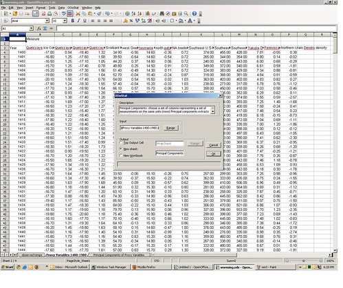
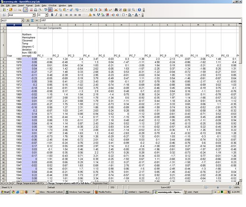
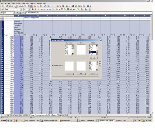
You can find the principal components of the 15 proxy variables on the third tab in the spreadsheet, which I obtained with Open Office’s OOo Stats macro. Starting in column P, there are 15 principal components for the years 1400 to 1980.
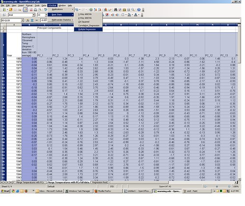
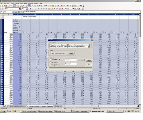
You can replicate my PCA by doing the following: go to the second spreadsheet tab, the one containing the proxy variables. From the OOo Stats menu, select “Multivariate Statistics” ==> “Principal Components.”
This will bring up the Principal Components dialog box. For “range” select the rows and columns containing the proxy data, along with the column header row 3 (range B3:P584 — do not use the year column). For “Output” select “New Sheet” and give it a name in the text box. Now click “OK.”
Depending on the speed of your computer, this may take 2-10 minutes to complete, so go grab a beer. You may see a little warning box pop up with the message “warning: failing to converge,” but just click OK, it will eventually identify the correct principal components (I validated it against other stat software packages). The new principal components output sheet you named should be identical to the one provided.
Step 4: Inner merge the extracted principal components with the instrumental temperature data
Now that we’ve got the 1856-2001 observed temperature series (tab 1) and the 1400-1980 proxy variable principal components (tab 3), let’s match them up by common year. The initial match is in tab 4.
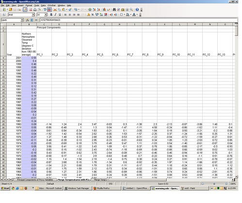
Note that for recent years (1981-2001) we have an observed temperature, but no proxy principle components; for years before 1856, we have proxy principle components but no observed temperature. Lets subset this down to only those years for which we have both temperature and principle components (1856-1980). That subset is on tab 5 of the spreadsheet.
Step 5: For the common years, fit a regression model between instrumental temperature and the proxy variables
Now this is where the analytical rubber meets the road, where we find a functional equation to link temperature to the proxy variables through the principal components. The approach of Mann et al. is to use multiple regression. A basic multiple regression equation looks like this:
Yi = β0 + β1X1i + β2X2i + … + βkXki + εi
Where Y is some variable you want to explain / predict, [X1 … Xk ] are the variables you want to use as predictors, [β0 … βk] are a set of coefficients, and ε is error. A regression analysis finds the values of [β0 … βk] that minimize the squared error in prediction. In our example case of Mann-style temperature reconstruction,
Temperaturei = β0 + β1P1i + β2P2i + … + β15P15i + εi
Where the P’s are the principal components. I ran this multiple regression, and the β coefficient estimates are on tab 6 of the spreadsheet, in the range C129:C144. In the above regression model β1 is -0.01 (cell C129), β1 is +0.05 (cell C130), and so on. The Y intercept value β0 is -0.23 in cell C144.
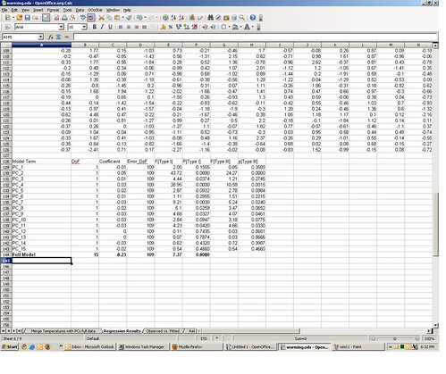
If you want to replicate how I got these estimates, go to tab 5 of the spreadsheet, containing the matched temperature and proxy principle components data. Select the range containing the data (cells B3:Q128). Now from the OOo Stats menu select “Basic Statistics” ==> “Multiple Regression.”
This will bring up the multiple regression macro dialog box. Under “Output” click “New Sheet” and give it a name, then click “OK.”
This will bring up the regression model specification dialog box. One by one click the values “PC_1,” “PC_2,” etc. under “Model”and they are added in the regression model specification box below it.
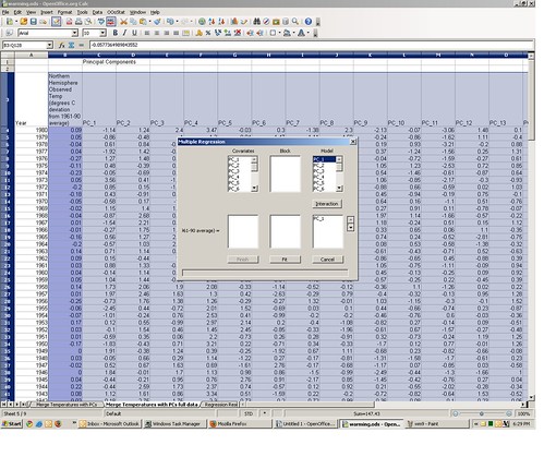
Once the all of the PCs are added, click “Fit.” There will soon appear a new regression output worksheet tab with the name you specified, identical to the one included with the original spreadsheet.
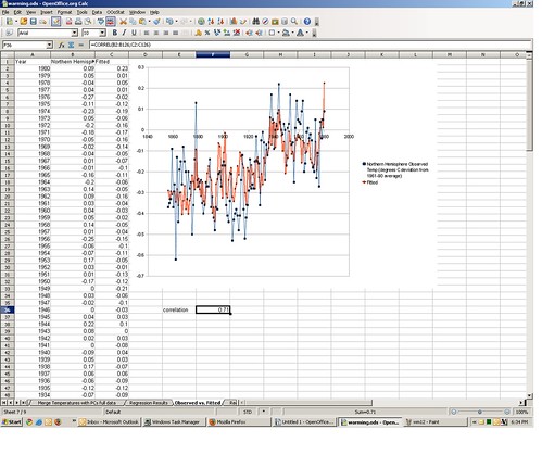
Step 6: Evaluate how well the regression model fits the observed temperature data.
If the regression model we specified is any good, it ought to fit the temperature data where we know it. The predicted temperatures can be found by applying the estimated β coefficients to the proxy variable principle components…
Predicted Temperaturei = β0 + β1P1i + β2P2i + … + β15P15i
The regression output computes this prediction for us; you can find it in the regression output tab in column Q. I merged the predictions with the actual temperature for 1856-1980 and put it in tab 7, along with a plot. The blue line is actual, the red line is the prediction from the model. It’s not perfect, but it tracks okay. The correlation between actual and predicted is .71. The squared correlation (r2) is .50, meaning 50% of the variation in actual 1856-1980 temperatures can be accounted for by the principal components (and by inference the original ice core and tree ring proxy variables).
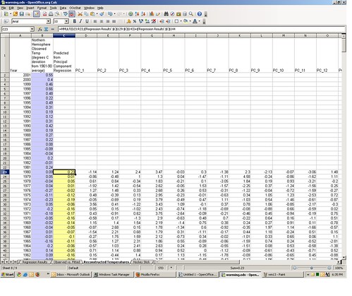
Step 7: Apply the regression coefficients to the years before observed temperatures to reconstruct estimated temperatures
Now that we’ve (weakly) validated the regression model, we are finally at the point where we can compute a historical temperature reconstruction. Remember, in the years 1400 to 1855 we do not have any observed temperatures, but we do know the proxy variable principle components. For these years, we can also use the regression model:
Predicted Temperaturei = β0 + β1P1i + β2P2i + … + β15P15i
Tab 8 of the spreadsheet shows the predicted values for each year from 1400 through 1980, in column C (highlighted in yellow). Predictions of 1981-2001 can’t be computed from the model because the proxy variable series stops at 1980. The formula in cell C23, i.e.
=MMULT(D23:R23; ‘Regression Results’.$C$129:$C$143) + ‘Regression Results’.$C$144
is equivalent to the temperature prediction equation above; it cross multiplies each principle component with its associated β coefficient, adds them up and finally adds in the β0 intercept value. We can apply this formula to every year for which we have proxy data, which gives us a Northern Hemisphere temperature reconstruction all the way back to 1400 AD.
A time series graph of the reconstructed temperatures (red) overlaid with actual temperatures (blue) appears on tab 9 of the spreadsheet.
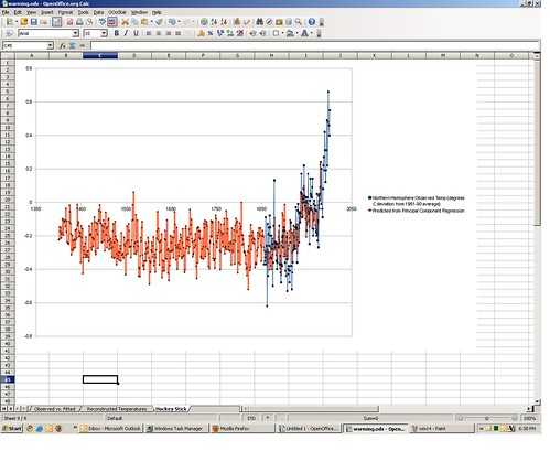
Voila, it sure does looks like that famous hockey stick — relatively flat for 500 years, then zooming up like a mo-fo right after MTV debuted. The one thing that is missing here is the error band (the grey zone around the hockey stick line way back up the post). That’s approximated by
Upper 95% confidence band = Predicted Temperature + 1.96 * stdev(ε)
Lower 95% confidence band = Predicted Temperature – 1.96 * stdev(ε)
where stdev(ε) = the standard deviation of the column labeled “residual” on tab 6.
Quick! Get us an NSF grant, stat!
Discussion
Again, all that math-y spreadsheet-y stuff above was not meant to perfectly replicate any specific study done by Mann et al.; those specific studies differ by the choice of instrumental temperature data set, the choice of proxy variables, whether series are smoothed with a filter (Fourier transform etc), and so on. My goal was to provide interested people with a hands-on DIY example of the basic statistical methodology underlying temperature reconstruction, at least as practiced by the leading lights of “Climate Science.”
If you’ve followed all this, it should also give you the important glossary terms that should help you decipher the Climategate emails and methodology discussions. For example “instrumental data” means observed temperature; “reconstructions” are the modeled temperatures from the past; “proxy” means the tree ring, ice core, etc. predictors; “PCs” mean the principal components.
Is there anything wrong with this methodology? Not in principle. In fact there’s a lot to recommend it. There’s a strong reason to believe that high resolution proxy variables like tree rings and ice core o-18 are related to temperature. At the very least it’s a more mathematically rigorous approach than the earlier methods for climate reconstruction, which is probably why the hockey stick / AGW conclusion received a lot of endorsements from academic High Society (including the American Statistical Association).
The devil, as they say is in the details. In each of the steps there is some leeway for, shall we say, intervention. The early criticisms of Mann et al.’s analyses were confined to relatively minor points about the presence of autocorrelated errors, linear specification, etc. But a funny thing happened on the way to Copenhagen: a couple of Canadian researchers, McIntyre and McKitrick, found that when they ran simulations of “red noise” random principle components data into Mann’s reconstruction model, 99% of the time it produced the same hockey stick pattern. They attributed this to Mann’s method / time frame for selecting of principle components.
To illustrate the nature of that debate through the spreadsheet, try some of the following tests:
Run step 3 through step 7, but only use the proxy data up through 1960 instead of 1980.
Run step 5 through step 7, but only include the first 2 principle components in the regression.
Run step 3 through step 7, but delete the ice core data from the proxy set.
Run step 2 through step 7, but pick out a different proxy data set from NOAA.
Or combinations thereof. What you’ll find is that contrary to Mann’s assertion that the hockey stick is “robust,” you’ll find that the reconstructions tend to be sensitive to the data selection. M&M found, for example, that temperature reconstructions for the 1400s were higher or lower than today, depending on whether bristlecone pine tree rings were included in the proxies.
What the leaked emails reveal, among other things, is some of that bit of principal component sausage making. But more disturbing, they reveal that the actual data going into the reconstruction model — the instrumental temperature data and the proxy variables themselves — were rife for manipulation. In the laughable euphemism of Philip Jones, “value added homogenized data.” The data I provided here was the real, value added global temperature and proxy data, because Phil told me so. Trust me!
In any case, I’m confident that the real truth will emerge soon, hopefully while Mike and Phil are enjoying their vacations. In the meantime have fun and stay warm.
– IH
Posted: 12th, December 2009 | In: Reviews Comment (1) | TrackBack | Permalink