The Olympic Games 2012 Font Is The Worst In The World
 WHAT is the world’s worst font? Simon Garfield knows:
#1 The 2012 Olympic Font
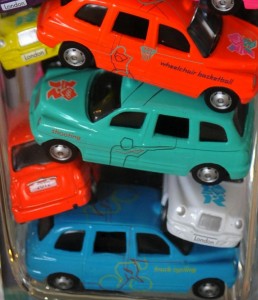
Precisely 800 days before the Olympic Games were due to start, the Official London 2012 shop began selling miniature die-cast taxis in pink, blue, orange and other shades, the first of forty such models, each promoting a different sport. The cabs are not like the lovingly crafted ones you can buy from Corgi, with opening doors and jewelled headlights, more the lumpy ones sold in Leicester Square to tourists in a hurry. Why should this matter? Because they are an example of very bad design, something London has largely begun to shun in recent years. What makes them doubly bad is the packaging, which comes with a bit of trivia about all the Olympic and Paralympic sports, each heralded with the question “Did You Know?” in what is surely the worst new public typeface of the last 100 years.
Go on:
The font is based on jaggedness, not usually an attribute where sport is concerned.
The London 2012 Olympic Typeface, which is called 2012 Headline, may be even worse than the London 2012 Olympic Logo, but by the time it was released people were so tired of being outraged by the logo that the type almost passed by unnoticed. The Logo was the subject of immediate parody (some detected Lisa Simpson having sex, others a swastika), and even the subject of a health warning–an animated pulsing version was said to have brought on epileptic fits. In the International Herald Tribune, Alice Rawsthorn observed that “it looks increasingly like the graphic equivalent of what we Brits scathingly call–‘dad dancing’–namely a middle-aged man who tries so hard to be cool on the dance floor that he fails.”
Like the logo, the uncool font is based on jaggedness and crudeness, not usually considered attributes where sport is concerned. Or maybe it’s an attempt to appear hip and down with the kids–it looks a little like the sort of tagging one might see in 1980s graffiti. It also has a vaguely Greek appearance, or at least the UK interpretation of Greek, the sort of lettering you will find at London kebab shops and restaurants called Dionysus. The slant to the letters is suddenly interrupted by a very round and upright o, which may be trying to be an Olympic Ring. The font does have a few things going for it: it is instantly identifiable, it is not easily forgettable, and because we’ll be seeing so much of it, it may eventually cease to offend. Let’s hope they keep it off the medals.
From Just My Type by Simon Garfield. Published by arrangement with Gotham Books, a member of Penguin Group (USA) Inc. Copyright © 2010 by Simon Garfield.
Posted: 8th, November 2011 | In: Sports Comment | TrackBack | Permalink


