IT’S RARE for a product’s logo or package design to stay constant over the years. More often than not, they get a makeover every few years to keep up with the tastes of the times.
Comparing soda cans from decades past to the present, it’s immediately apparent that we no longer prefer simple elegant designs… that we prefer busy, hastily thrown together crap designs instead.
Take for instance, Diet Rite…

The early design was beautifully simple, with the only declaration being that it’s a measly one calorie. The new can declares: zero calories, zero caffeine, zero sodium… hence, PURE ZERO! Which begs the question – what exactly is in this obnoxious can? Perhaps they’re all empty.
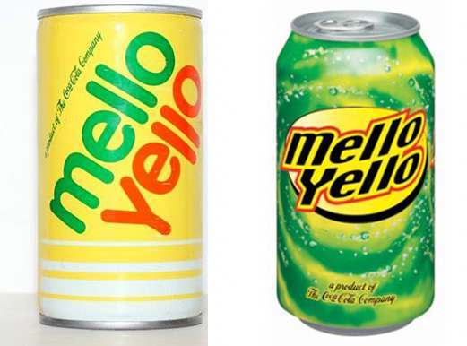
Again, a simple design is the most effective. It’s branding 101 – you want a design that’s easy to remember and readily associated with your product. The new Mello Yello cans, in stark contrast to the iconic originals, are a hellacious mess.
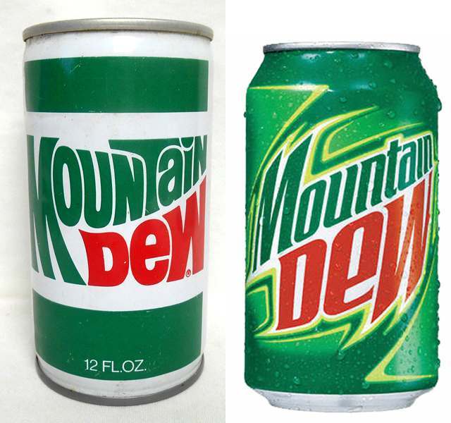
Mountain Dew has made the same mistake as Mello Yello in busying up the can for no reason. Interestingly, they both have recently (and temporarily) reverted back to their “retro labels”. Call it a cheap ploy to boost sales, I call it a refreshing change.
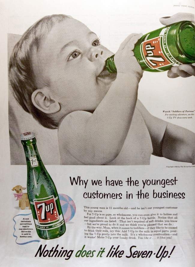
Americans, who literally come out of the womb in a mad lust for these bubbling cans of high fructose corn syrup, don’t want their labels besmirched. It’s not necessary to deface these once beautiful (yes, I said it), cans to incite Americans to drink. In the States, they could be labeled with a skull and crossbones and marked “deadly poison” and they’d still sell by the gallon.
Perhaps the biggest offender is Mr. Pibb…
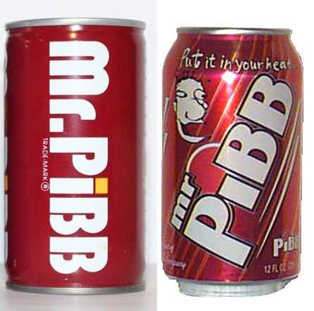
Was it really necessary to jettison a nice, neat design in favor of an incompetently drawn cartoon face with the words “Put it in your head”? I’m thinking “no”.
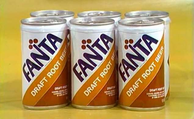
I recently watched a Price Is Right episode from the 1970s and took a screen capture of this six-pack of Fanta they had on display, (I’m strange that way).
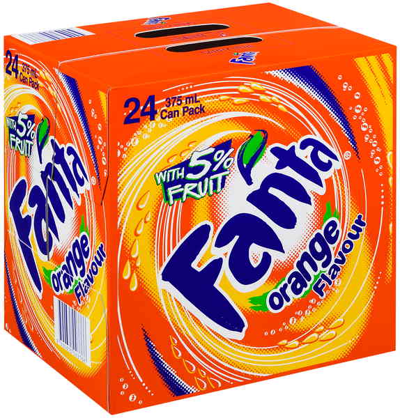
Now, compare that to a pack of Fanta today…
At what point did everything go ape shit? When did it become undesirable to have simple, yet effective designs, and instead let crowded, swirling, eye-assaults rule the day?
Quite possibly it was the 1990s…
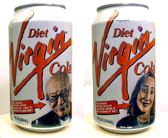
“Recycle me. I want to come back as a nose ring” reads the can on the left. (groan) At least now we know who to blame. Thanks, Richard Branson.
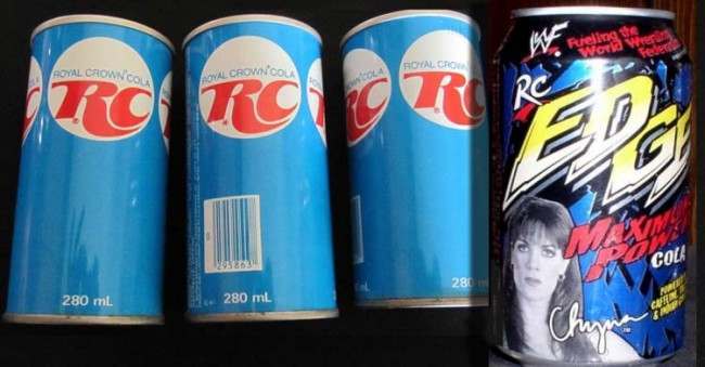
Finally, to see if you’ve been paying attention, here is a pop quiz. Which of the Royal Crown Cola cans above is from the 2000s? (Hint: It’s the one that made me lose faith in humanity.)
Would you like to support Flashbak?
Please consider making a donation to our site. We don't want to rely on ads to bring you the best of visual culture. You can also support us by signing up to our Mailing List. And you can also follow us on Facebook, Instagram and Twitter. For great art and culture delivered to your door, visit our shop.