
Worst US Soccer Kits!

WITH Stevie Gerrard looking like he’s off to play football in the United States of America, most likely to live in the sunny climate of Los Angeles to play for David Beckham’s old lot at the Galaxy, it is worth remembering just how weird it’ll be, seeing Gerrard in a kit that isn’t England or Liverpool’s.
And speaking of kits, America has had some of the most dismal jerseys imaginable. With everyone being fans of retro kits these days, it is nice to imagine the Anfield legend playing in some of these abominations.
Here’s some of the most stomach turning kits in American soccer’s history.
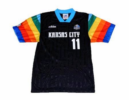
Kansas City Wizards
The Wizards’ kit is a funny one because, even though it is clearly an absolute howler of a kit, there’s something that is borderline nice about it. Obviously, you have to have an eye for all things ’90s, but those rainbow sleeves are as pleasing as they are vomit-inducing.
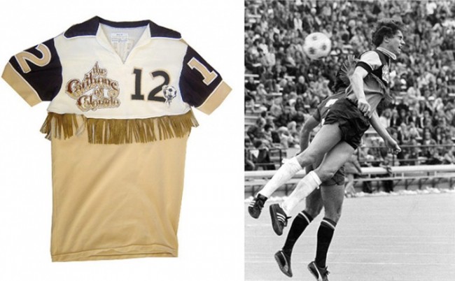
Colorado Caribous
Perhaps the worst/best kit in football’s long history, the Caribous turned out in a beige number which had delightful tassles on the chest. They didn’t exactly light up the North American Soccer League. They played for one season and lost 22 of their 30 games.
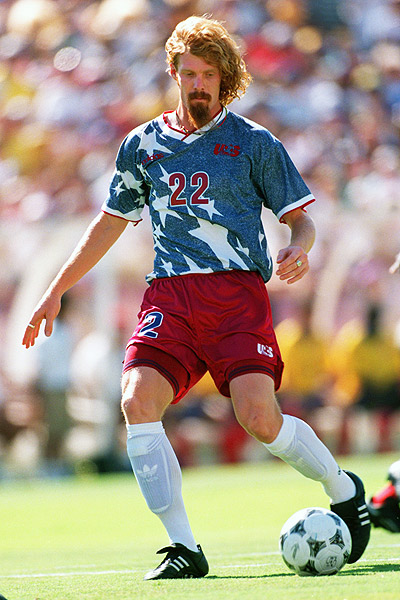
USA ’94
When America was awarded the FIFA World Cup in 1994, they didn’t play in that lovely all-white we see them in now. The home kit was red and white stripes, like the stripes of the star spangled banner. The away kit completed the flag with a pretty awful blue thing covered in stars.
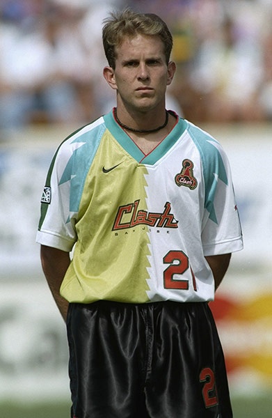
San Jose Clash
The San Jose Clash clearly took the ‘clashing’ element of their name and applied it to this horror show. A lovely minty teal with urine yellow and ketchup red. Nike’s design room clearly knocked this up at 5 to 5 on a Friday when they all wanted to get down the pub.
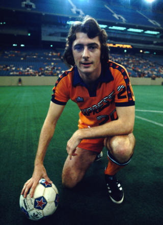
Detroit Express
Even though this lovely photo of Trevor Francis doesn’t really do it justice, the Detroit Express kit was a particularly horrible shade of orange, that was only found in the 1970s. Admiral, the kit makers, were known for their bold designs, so in a way, there’s a certain charm to it,
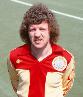
New England Tea Men
To really ram home the name of the New England Tea Men, Umbro thought it might be a fun idea to stick a gigantic letter ‘T’ on all the kits. The awkward design was only matched by the awkward perms as displayed by some of the players.
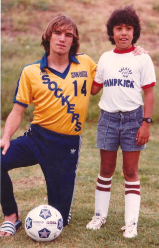
San Diego Sockers
While not the most disgusting kit in memory, you have to include the mighty San Diego Sockers because, when the players ran across the pitch, if the material folded, it looked like they were called the ‘Suckers’.
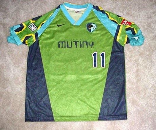
Tampa Bay Mutiny
The kit was a disaster and so too, was the Tampa Bay Mutiny franchise. No surprise really as what player would want to run out in this garish number? Fans weren’t likely to be too keen on it either.
Posted: 26th, September 2018 | In: Fashion, Sports Comment | TrackBack | Permalink