
Watch the live Coronavirus tracking map

You can keep track of the coranavirus with this tracking map run by America’s Johns Hopkins University.
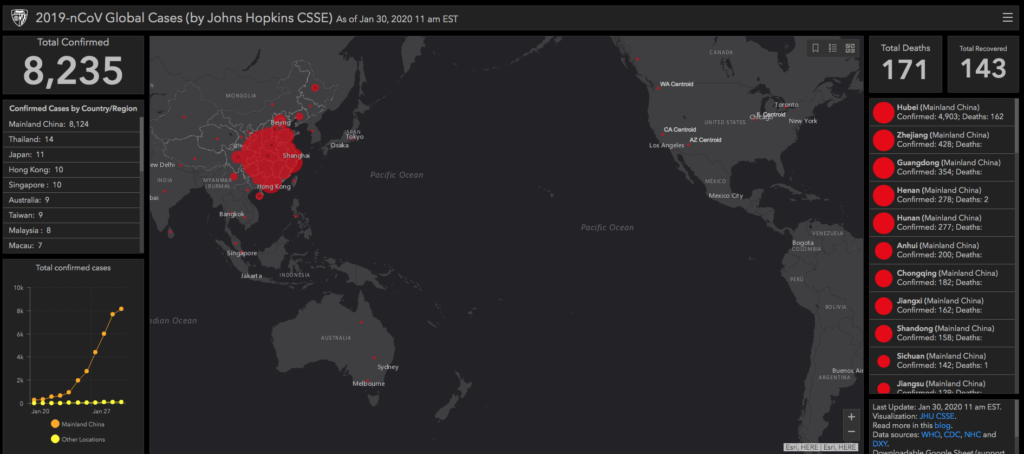
In response to this ongoing public health emergency, we developed an online dashboard (static snapshot shown below) to visualize and track the reported cases on a daily timescale; the complete set of data is downloadable as a google sheet. The case data visualized is collected from various sources, including WHO, U.S. CDC, ECDC China CDC (CCDC), NHC and DXY. DXY is a Chinese website that aggregates NHC and local CCDC situation reports in near real-time, providing more current regional case estimates than the national level reporting organizations are capable of, and is thus used for all the mainland China cases reported in our dashboard (confirmed, suspected, recovered, deaths). U.S. cases (confirmed, suspected, recovered, deaths) are taken from the U.S. CDC, and all other country (suspected and confirmed) case data is taken from the corresponding regional health departments. The dashboard is intended to provide the public with an understanding of the outbreak situation as it unfolds, with transparent data sources.
See it here.
.
Posted: 30th, January 2020 | In: News Comment | TrackBack | Permalink